
Why the UN Changed the World Map, and How Indonesia Differs in the New and Old 'Atlas'
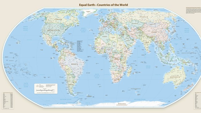
Jakarta, CNBC Indonesia – The United Nations has just decided to change the world map projection used internationally. As many as 164 countries supported the change, but one country rejected it. The change was made because the standard world map used for 450 years turned out to depict the size of continents and countries inaccurately, particularly Africa, which appears far smaller than it actually is.
The world map used all this time is known as the Mercator projection. It was created by Gerardus Mercator in 1569 and designed so that sailors could determine direction accurately when crossing the oceans.
However, its strength in showing direction came at the cost of the true size of territories. The closer a region is to the poles, the larger it appears. Conversely, countries located around the equator appear far smaller than their actual size.
Differences Between the New and Old Maps
Here is a clear comparison between the old Mercator map and the new Equal Earth map now backed by the UN:
Old Map – Mercator Projection
Created in 1569, designed for maritime navigation
Countries near the poles appear far larger than they actually are
Countries near the equator appear far smaller than they actually are
Africa looks almost the same size as Greenland, when in fact Africa is 14 times larger than Greenland
North America and Europe appear far larger compared with Africa and South America
For centuries, this map shaped a worldview in which northern countries seemed bigger and more important
New Map – Equal Earth
Designed in 2018, it displays territories according to their actual area
Africa appears at its true size, equivalent to the combined area of the United States, China, India, Japan, Mexico and parts of Europe all at once
There is no longer any enlargement of regions near the poles or shrinkage at the equator
The shape of continents is well preserved without excessive distortion
Developed by a team of international cartographers to be fair and accurate
Why Did the UN Change the Map Now?
The initiative was put forward by Togo on behalf of all member states of the African Union. At the UN session, Togo’s Foreign Minister, Robert Dussey, stated that a map is not merely a drawing on paper.
“A map is never neutral. Maps shape the way we think, influencing how we understand the standing of nations and continents in the world,” Dussey said.
For centuries, the Mercator map was considered to have instilled a distorted view, as continents in the north appeared larger and more significant, whilst Africa and developing countries appeared small and insignificant. That is why this map change is also described as a step towards fairness in how the world is depicted.
Of the 165 countries that voted, 164 supported the change. Six countries abstained. However, only one country firmly rejected it: the United States.
The United States Permanent Representative to the UN Economic and Social Council stated that discussing the map was a waste of time and should not have been on the UN agenda. Most other countries, however, saw the move as an improvement long overdue for nearly 450 years.
France also said it would follow suit by adopting a more accurate map. The European country plans to use a similar projection, which likewise displays continents according to their actual area.
What Does It Mean for Indonesia?
For Indonesia, which sits near the equator, the old standard map also made Indonesian territory appear far smaller than it actually is. With the new map showing sizes true to reality, the area of Indonesia and other Southeast Asian nations will appear larger and more proportionate compared with the maps we have long been used to.
This means the change to the world map is not merely a change of picture. It is a step towards the world beginning to see Africa, Indonesia and all countries around the equator as they truly are.
Source: jawawa.id (https://jawawa.id/newsitem/why-the-un-changed-the-world-map-and-how-indonesia-differs-in-the-new-and-old-atlas-1788781946)
Originally published by CNBC Indonesia (https://www.cnbcindonesia.com/tech/20260907144138-37-765838/alasan-pbb-ubah-peta-dunia-ini-perbedaan-ri-di-atlas-baru-dan-lama), translated from Indonesian