
Jakarta's 5th Centenary Logo: Meaning, Guidelines, and Official Download Link
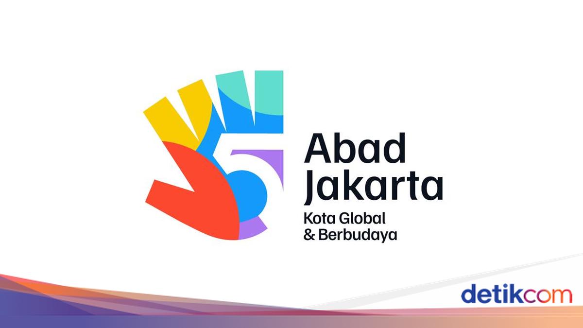
The Jakarta Provincial Government has launched the official logo for Jakarta’s 5th Centenary along with its visual identity guidelines. This material serves as a reference for use across various media and activities commemorating five centuries of the city. Residents, institutions, communities, and organising partners can officially access and download these visual materials. In addition to the logo, a usage guide is available containing the design philosophy, visual rules, and provisions for identity application to ensure a consistent appearance across different media.
According to the official 5th Centenary Jakarta website, the visual identity carries the theme ‘Igniting Hope’ as the spirit for welcoming Jakarta’s 500-year milestone. The theme depicts a momentum for Jakarta to continue moving towards becoming a global city that remains rooted in culture while providing hope for its citizens. The Visual Identity Guidelines explain that the logo is built from two main elements: the shape of the number 5 and a hand silhouette. The number 5 represents five centuries of Jakarta’s journey, while the hand silhouette symbolises the spirit of collaboration, mutual cooperation, care, and the involvement of all elements of society in building the city’s future. The guidelines also explain that the basic logo form is then developed into various supporting graphic elements that consistently maintain the visual identity across all communication media.
The Jakarta Provincial Government has also issued official guidelines to ensure uniform logo usage for various publication needs. The document outlines several basic rules to observe, including: the logo may only be used in official colour or white versions as stipulated; the logo’s orientation, composition, construction, or colour must not be altered; the logo must not be cropped, distorted, outlined, or have any elements removed; and logo placement must be in an area with adequate contrast and not on an overly busy background to remain easily legible. The guidelines also regulate the minimum logo size, clear space, and application on print and digital media to maintain legibility and visual identity consistency.
Beyond the logo, the official guidelines include a visual identity system comprising a colour palette, typography, photography, and supporting graphic elements. The colour palette is inspired by colours frequently seen in Jakarta during the day and night, serving as a reference for all visual communication materials to ensure a uniform character. The typeface used is Familjen Grotesk, chosen for its modern, inclusive character, readability, and free availability via the Fontshare platform. The guidelines also regulate typographic style, size, and layout to ensure consistent application across various media.
Residents can access the official logo and visual identity guidelines through the official 5th Centenary Jakarta website provided by the Jakarta Provincial Government. Various visual materials are available for use in accordance with the applicable provisions. Residents, institutions, and related parties can download the logo and visual identity guidelines officially. Logo usage is expected to follow the established provisions so that the visual identity of the Jakarta 5th Centenary commemoration remains consistent across all media.