BUMI Officially Unveils New Logo, Drives Diversification into Mineral Sector
PT Bumi Resources Tbk (BUMI) has unveiled a new visual identity as part of the company’s business transformation initiative. The logo change represents the company’s new strategic direction to expand its business portfolio beyond coal commodities.
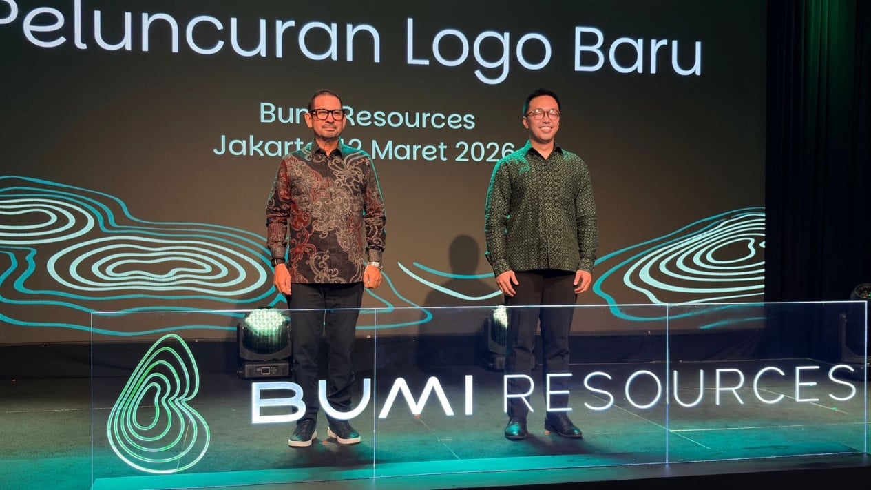
The new logo was launched at a press conference held at Plaza Senayan, Jakarta, on Thursday, 12 March 2026. Company management stated that the identity change is part of a long-term strategy to strengthen the company’s position in an increasingly dynamic natural resources industry.
Chief Corporate Affairs Officer of BUMI, Christopher Fong, said the identity change reflects a new phase for the company amid its business diversification efforts. According to him, the transformation is being undertaken as the company expands its business focus to various high-value mineral commodities.
“This is a very important moment for Bumi. We are undergoing transformation. We are beginning to move beyond thermal coal,” Christopher said at the logo launch press conference at Plaza Senayan on Thursday.
“We are not abandoning coal, but we are diversifying our focus to other sectors,” he added.
In recent years, BUMI has begun increasing investment in the mineral sector such as gold, copper, and bauxite. This move is regarded as a strategy to reduce dependence on coal whilst strengthening the company’s competitive edge in an increasingly competitive global market.
Company management stated that this portfolio diversification is part of a long-term strategy to develop BUMI as a more diversified natural resources company. Through expansion into strategic mineral commodities, the company hopes to create more sustainable business growth.
“The launch marks an important milestone in the Company’s transformation journey towards becoming an increasingly diversified and globally competitive natural resources company,” it said.
Beyond marking a new business direction, BUMI’s latest logo design also carries certain philosophy that reflects the company’s relationship with nature and resource management.
Christopher explained that the logo design elements were inspired by topographical contour lines. These elements depict the company’s closeness to nature whilst its responsibility in managing natural resources sustainably.